Landing Page Best Practices
Learn the 7 Secrets to Landing Page Best Practices
Dear Business Owner and Partner,
You’re spending money on Google Adwords, hired an SEO firm, have content being developed and are investing in social media. You’re doing the “online thing” right. You finally feel like you are doing it right and have a solid understanding of the web. Your business is seemingly everywhere. You may be asking yourself some of those common questions that we hear all the time:
- Why isn’t my phone ringing?
- Why am I not getting leads?
- Why is my bounce rate so high?
You think that you have it all figured out on the web, but in reality, you are struggling just like every small business out there. Something isn’t right. Perhaps it’s because the pages your visitors are landing on are not good landing pages. There are tons of elements that go into a solid landing page. First of all, the day of a single landing page is over. The entire site should resemble a landing page and optimize conversions. Your site should be a high-converting machine. It’s not quite that straight forward, however.
What is a landing page?
A landing page is simply that, a page that a user lands on to receive some sort of information. Each page on your site is essentially another landing page. A classic landing page has a singular focus and is designed to convert for a particular product or service. By convert, I mean persuade the user to take some sort of action on the web. This doesn’t have to be a monetary action. It can be simply an action that you want the user to take. This can be signing up for a form, a membership portal, or downloading an ebook. These are all forms of actions or conversions that exist on landing pages. This entire page is an example of a classic landing page.
The definition of a landing page is changing. I envision a site that every page is designed to persuade the user to convert. The entire goal is to get the user to opt into some sort of offer. Each page on your site should be optimized with this singular focus in mind. This isn’t to say that it is still not wise to have a landing page with a singular focus, you just should always be considering how you can help someone out by offering them a product or service. Every page on your site should be a landing page. As you browse this page, you will see certain elements that scream landing page. This particular page is called a long-form sales letter. It is very lengthy and that’s the purpose: provide a ton of information up front so that you are an authority or trusted source on the subject.
There are elements that are more or less required on a landing page and these are considered the Landing Page Best Practices.
What are the Landing Page Best Practices?
So there isn’t any right or wrong way to build a landing page. Anything is qualified as a landing page. There is a clear distinction of just a landing page and high converting landing page. Let’s pick one apart.
Keep in mind, this is an example landing page and there are DOZENS of other styles. This particular one does not have an opt in form because it is designed to drive traffic to a particular portion on the bottom of the page. The goal of this page is to get clicks to the orange button on the bottom. You can swap the “video” with an opt-in form.
Before we begin to pick apart a landing page, I want to note how important this next portion is. Keep this in mind when you are building landing pages. Users eyes migrate in a “Z” pattern on a screen. Putting anything they want to take action with is usually recommended on the right hand side of the page. Your forms will convert 30%+ higher than normal when following the “Z” rule. Always put all opt in forms on the right hand side of the page. We are used to this and you will have a much higher probability of someone seeing this as opposed to somewhere else on the page.

Now that you understand the “Z” rule, it’s time to tackle the landing page itself. Let’s figure out the anatomy of a landing page. Below are the 7 Secrets to Landing Page Best Practices
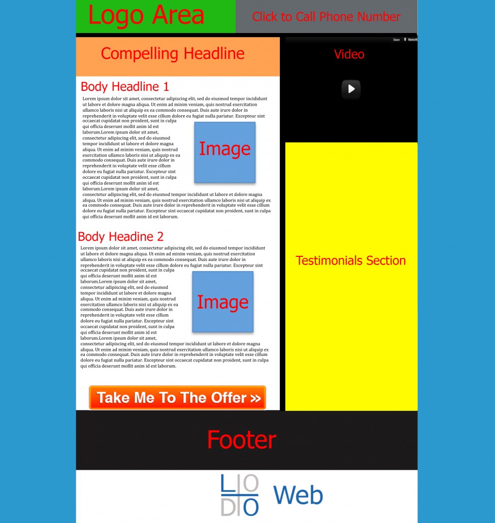 1. Logo Area
Because users eyes navigate in the “Z” pattern, a logo at the top left is a must. This helps establish an authority and immediately associates your potential customer with your company. This establishes the brand identity that you are seeking to create within your customers mind. Throughout the entire read of the landing page, the customer will be thinking about your company.
2.Click to Call Phone Number
A click to call phone number enables the user to call you with one click. This is essential to have especially for smart phones. What it does is it activates the app on the phone with your number inserted immediately. This allows you to dial the user right away, without having to copy and past the phone number manually. Placing the phone number makes it obvious what your goal is from the potential customer. Making it a click to call just makes it easier.
3. Clear Compelling Headline
All landing pages share something in common. As you noticed the title of this page is “Learn the 7 Secrets to Landing Page Best Practices”. This immediately tells you what this page is going to be about, without any distractions. This is very clear right from the start and sets up the expectation of what your page is going to be about. This is huge. If you don’t establish this right away, you will increase your bounce rate.
4. Video
Including a video here will allow your potential customers to quickly see who you are and adds a “human element” into the web presence. As mentioned earlier, this can be replaced with an opt in form. Placing the video here gives the impression that you are indeed a human and are just like the potential customer. You want to relate with them as much possible. The opt in form here, because of the “z” pattern, will naturally attract the eyes of the visitors. This increases your conversion rate.
5. Body with Image
First you need a headline for each one of your body sections. This headline needs to be compelling and talk about the benefits of the product first, and then the features. Benefits before features. An example of a benefit headline is Participants Lost 17 Pounds in this Clinical Study (16% Body Fat). This tells the potential customer how they can benefit from your product, before talking about the features. Each text block should go into the benefit briefly. The next major body headline should talk about the features of the product or service and go into more details about the product. Hence the features. Inside each block you may put an image to help break up the text. This helps engage the visitor with some visual “eye candy” to help breakup the boring page of text of a traditional landing page.
6. Testimonials Section
Testimonials can be text testimonials, before and after images, companies you’ve worked with or any other number of testimonials. These help increase your authority and show you that you are a big deal to work with. You often see all the publications you’ve been apart of or any large clients you’ve worked with. This further establishes your authority on the subject matter.
7. Clear Call To Action
Notice the call to action at the bottom of the page. It is a statement: Take Me To The Offer. This is arguably the most important portion of the entire landing page as it tells the potential customer what you want them to do. In this case we are taking them to an offer page, but it can easily be a form opt in, lead opt in, newsletter opt in, or additional links. Whatever it is you want the potential customer to do on your page is what you should be marketing. This is why it’s called a call to action.
By the way, did I mention the team at LoDo Web are experts at making high converting landing pages? In case you weren’t aware, you can contact us at any time to increase the conversions for your business. The above is just an example of a great landing page that can help you get some inspiration for your next advertising campaign.


 Your information will *never* be shared or sold to a 3rd party.